
We have quite a few outdoor enthusiasts in our team. Fabian, for example. He’s always kitting himself out with the latest gear and regularly pitches his tent in the middle of nowhere. So we were raring to go when Bever – the Netherlands’ largest outdoor retailer and part of the A.S. Adventure family – rang us and asked for help.
Challenge
Bever and the other members of the family – A.S. Adventure and Cotswold – are renowned as the leading outdoor experts in the Netherlands, Belgium and England. In their physical stores, customers find quality and expertise. But that great in-store experience wasn’t coming across effectively online. It was time to turn this around.
Solution
Our designers and researchers have immersed themselves in the outdoor world and laid new foundations for all three online shops. Every pixel we have designed has been shaped by customer insights and the essence of the brands.
Services
A dive into the world of the outdoors
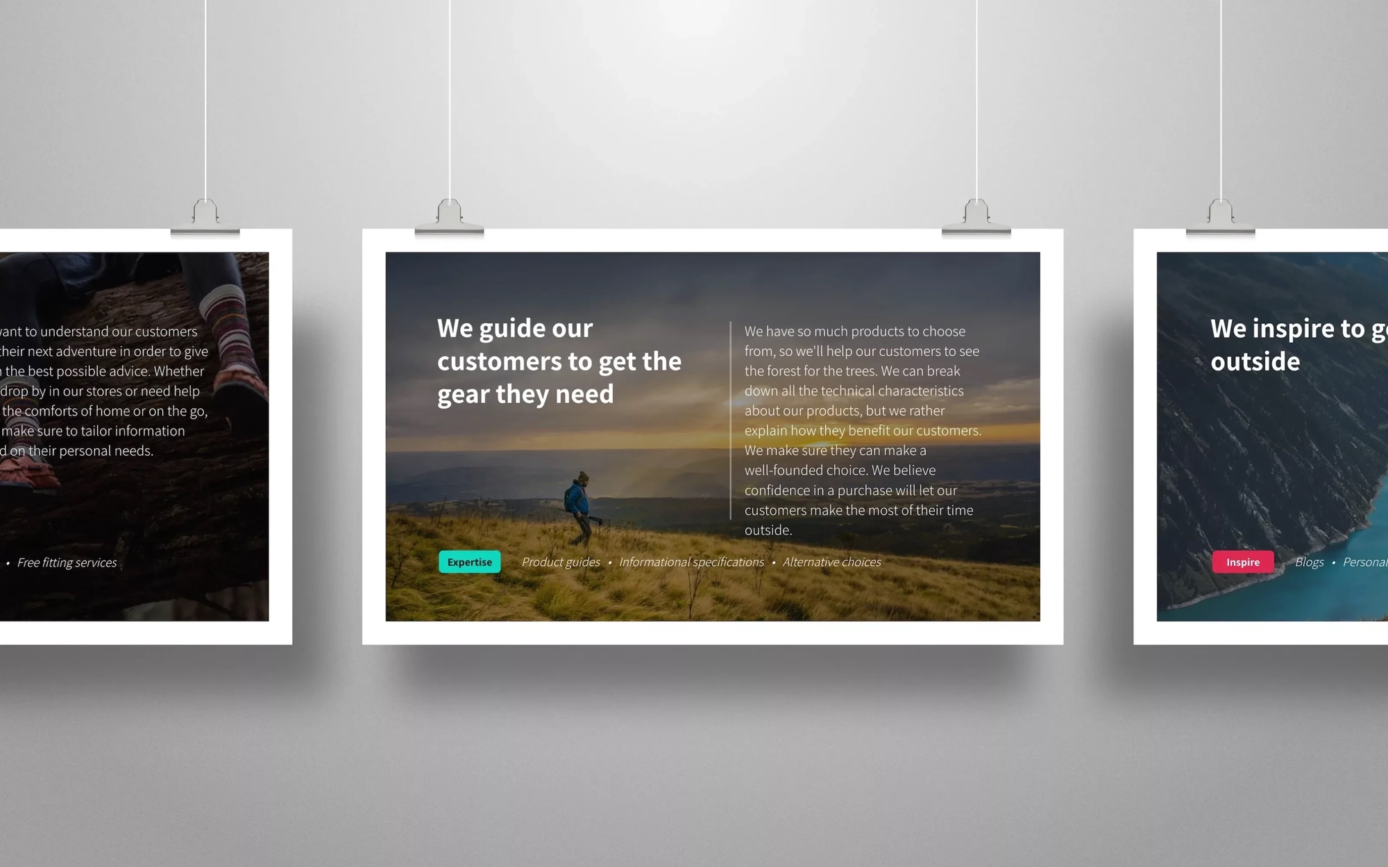
Bever, A.S. Adventure and Cotswold are brands with a long history. So we began the project with a series of workshops in which we discussed the essence of the brands, their core values, their promises, their market and their objectives.
Simply understanding the brands is not enough to build a new online foundation. Understanding customers is just as important. We’ve gone through previous research together. We’ve reviewed feedback and analysed the analytics. Who exactly are the A.S. Adventure, Bever and Cotswold customers? How do they differ from one another? What are the key nuances? How do customers currently use the website? What do we know about their goals, needs and frustrations?
Delving even deeper
Thanks to the workshops, we already knew a great deal about outdoor consumers. But an inside-out perspective alone isn’t enough. We still had plenty of assumptions and questions. We set to work on these through remote interviews. We spoke to outdoor enthusiasts from the Netherlands, Belgium and England. We learnt how they shop online, what issues they encountered, what they liked about the current websites and what could be improved.
“As I own this jacket myself, I know it has lovely features such as an inside pocket, but the website doesn’t show this”
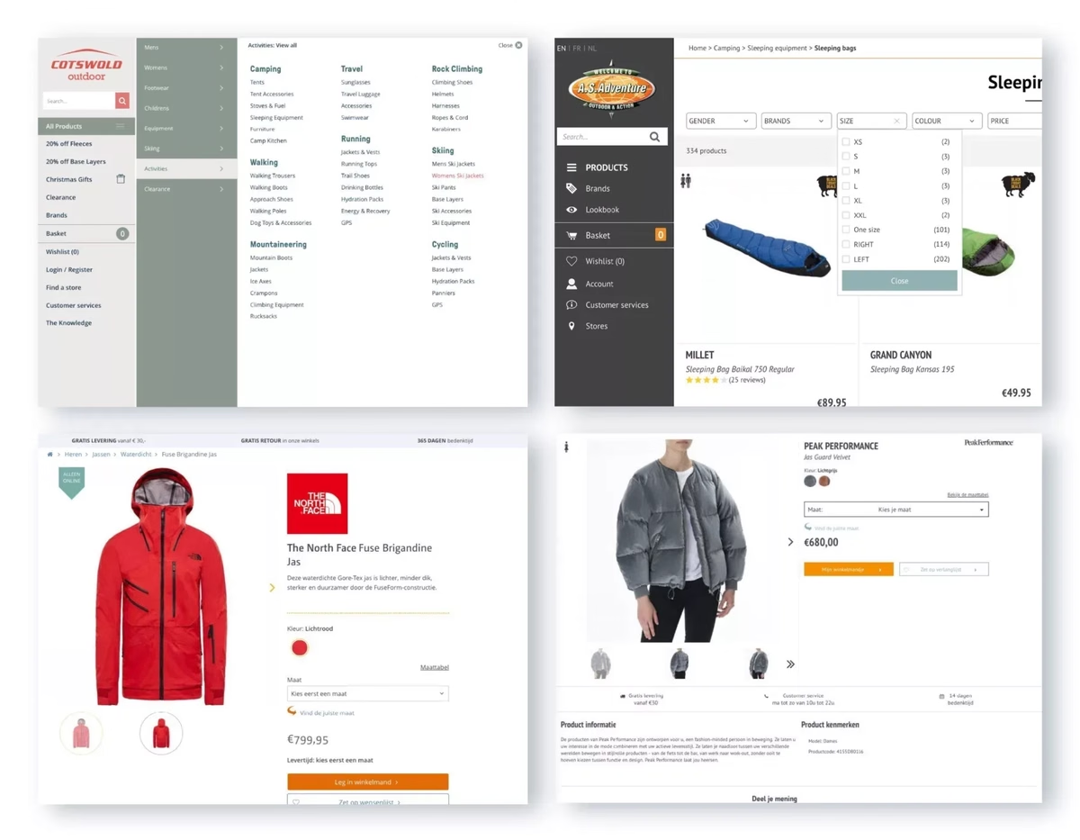
We learnt a great deal from the stories shared by participants. Finding the right product and drawing up a ‘shortlist’ proved difficult. On all three online shops, customers struggled to find the right categories. There were too many options. Filters felt arbitrary and confusing. Another
example: participants expected to find inspiration on product pages – but there wasn’t any. It was difficult for them to get a good impression of the product. Photos didn’t show any specific features. Taken together, all these factors led to serious doubts about value for money.
In other words: after the workshops and interviews, we knew exactly what we needed to tweak.
Bring the insights to life
We compiled all the insights – from the smallest details to more conceptual issues – into a slide deck and presented them to the teams. This included recordings of the interviews; recordings are a good way to bring the customer to life and create a sense of urgency. We also drew up a list of quick ‘UX fixes’ to give the current sites a boost whilst we were working on the new foundation.
Getting started with the redesign
A clear understanding of the brands and their market? Check. An in-depth understanding of customers? Check. To guide the design process, we first developed a set of design principles. You can think of design principles as a shared understanding that helps you make better decisions more quickly. They ensure that your design work is consistent and always remains in line with the brand and customer insights.
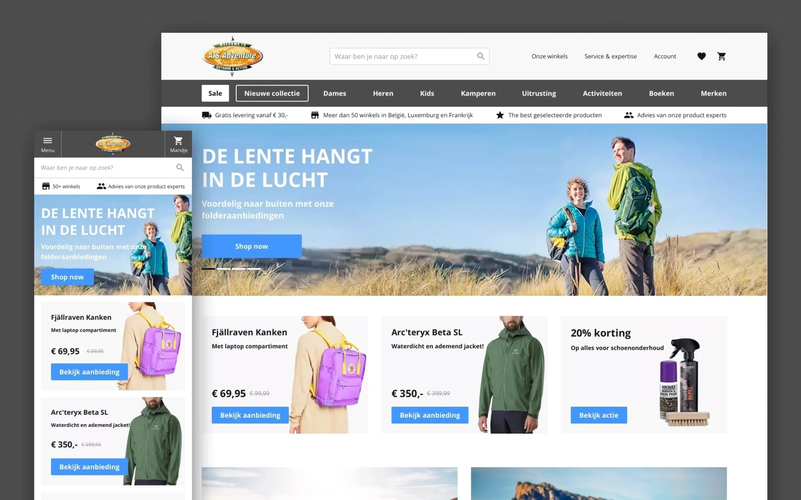
The A.S. Adventure site – the flagship of the family – was our starting point. We developed the key elements of their online shop, such as the homepage, category pages, product pages and the checkout. Ultimately, we adapted this foundation to create new designs for Bever and Cotswold.
To ensure we could adapt quickly during the design process, we worked partly from the A.S. Adventure office. Are we on the right track? What are your thoughts on element X? Is this technically feasible? Working closely together fosters understanding and a sense of ownership, and makes it far more likely that the designs will actually be adopted and built exactly as we intended. In addition, we regularly tested our concepts with customers during the design phase to ensure the designs met their expectations.
Talking to stakeholders and customers isn’t a one-off exercise – it’s a recurring part of the design process.
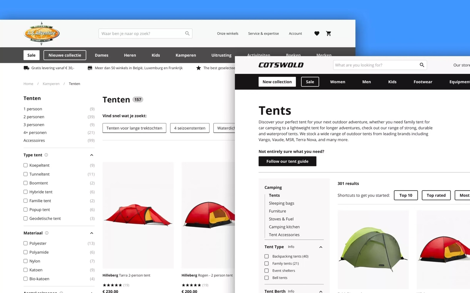
Developers and designers from A.S. Adventure, Bever and Cotswold have built on the concepts we established together. We stayed on board for a while initially to hand over our work, support the UX team and review the work. After a few weeks, we handed over the reins for good.
Is your website or app also in need of a fresh start? Then feel free to get in touch.
Authors
-

-
