
Floorplanner provides software for designing interiors. In 2D and 3D. From a single room to an entire house. You sketch out your space and experiment with your interior design, the layout and the colours. It needn’t take more than a few minutes, but you can also lose yourself in it for hours. Our project lead, Julian, used it to design his new home. So you know it’s the real deal.
The challenge
There was no specific challenge – that is precisely what makes this project so powerful. Floorplanner wanted to find out how they could give their ‘Roomplanner’ tool a boost. They were looking for inspiration. Where can we pick up the pace? Are we focusing on the right things? Or are there opportunities and issues that we’re completely overlooking?
The solution
We carried out a short research and design sprint. First, we presented Roomplanner to users in our lab. We learnt what was working well and what could be improved. We then created a redesign. Not to completely overhaul the current tool, but mainly to show what else it could be and how it could be made more logical and simpler.
Services
Right, first a bit more about Roomplanner
Roomplanner is a white-label tool. It’s built using the same technology as Floorplanner, but it’s simpler and more accessible. There’s virtually no learning curve. This helps ‘ordinary’ consumers to design their spaces, experiment and find inspiration.
Roomplanner reaches consumers via retailers, such as the American furniture chain Ethan Allen. They purchase the tool and embed it on their website. Their customers can then get started with it. They design their own space, choose templates, select products from the retailer in question, place them in the space and customise them as they wish.
To save your design, as a consumer you have to provide your details; that’s the catch for retailers. It provides them with a lead whose preferences they know inside out.
Our approach: a short research and design sprint
We kicked off with a small, practical UX research project. We sat down with the target group to find out what they thought of Roomplanner, how they used it and where there was room for improvement. We spoke to five people – enough to get a good sense of the main opportunities and issues.
During the research, we found that the main issue was that the tool is too complex – both in terms of usability and the range of options available. Roomplanner is designed for consumers, not architects: that makes a big difference. So, in our redesign, we’ve tried to make everything more logical and simpler.
To show what this looks like in practice, we’ll highlight three examples.
Example #1 – Clear steps in the onboarding process
In the old design, the onboarding process was split across several screens: it wasn’t immediately clear exactly which steps you needed to go through to get started.
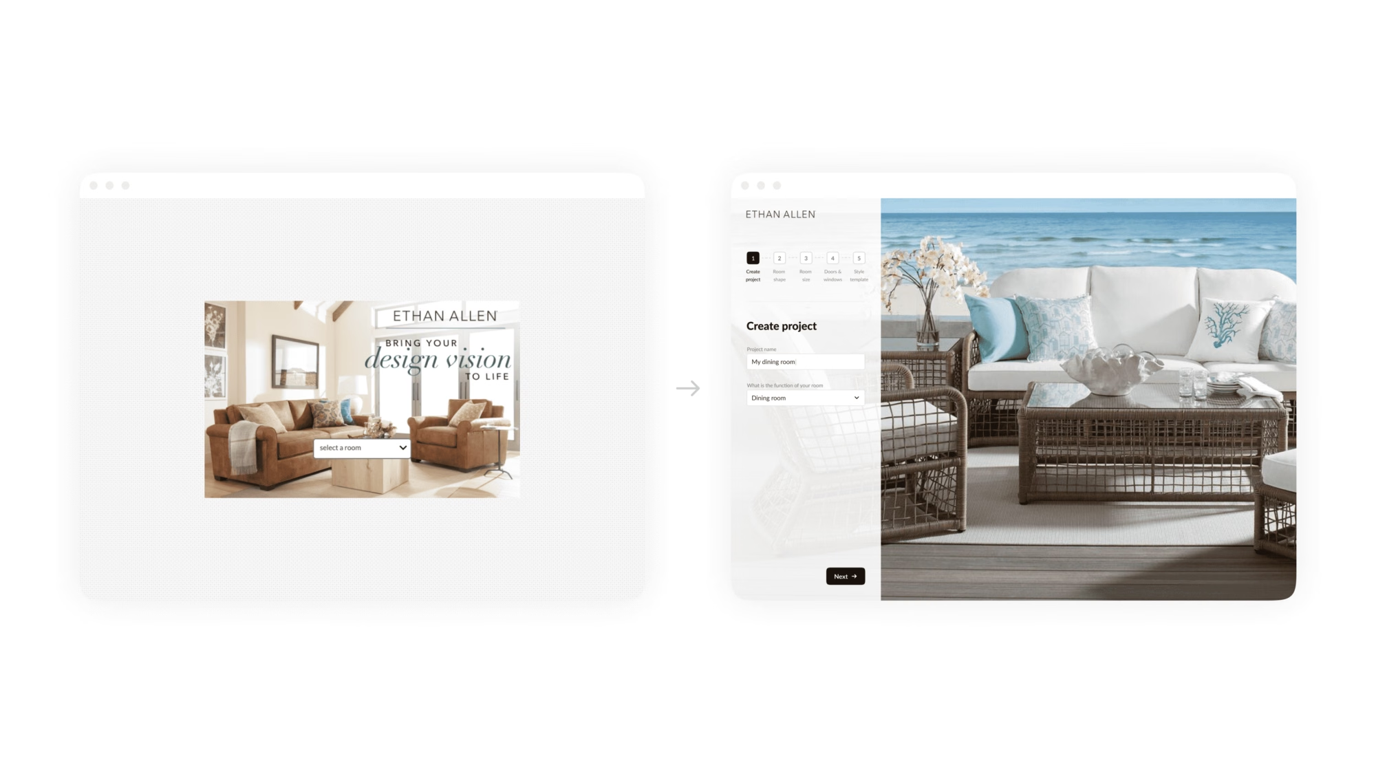
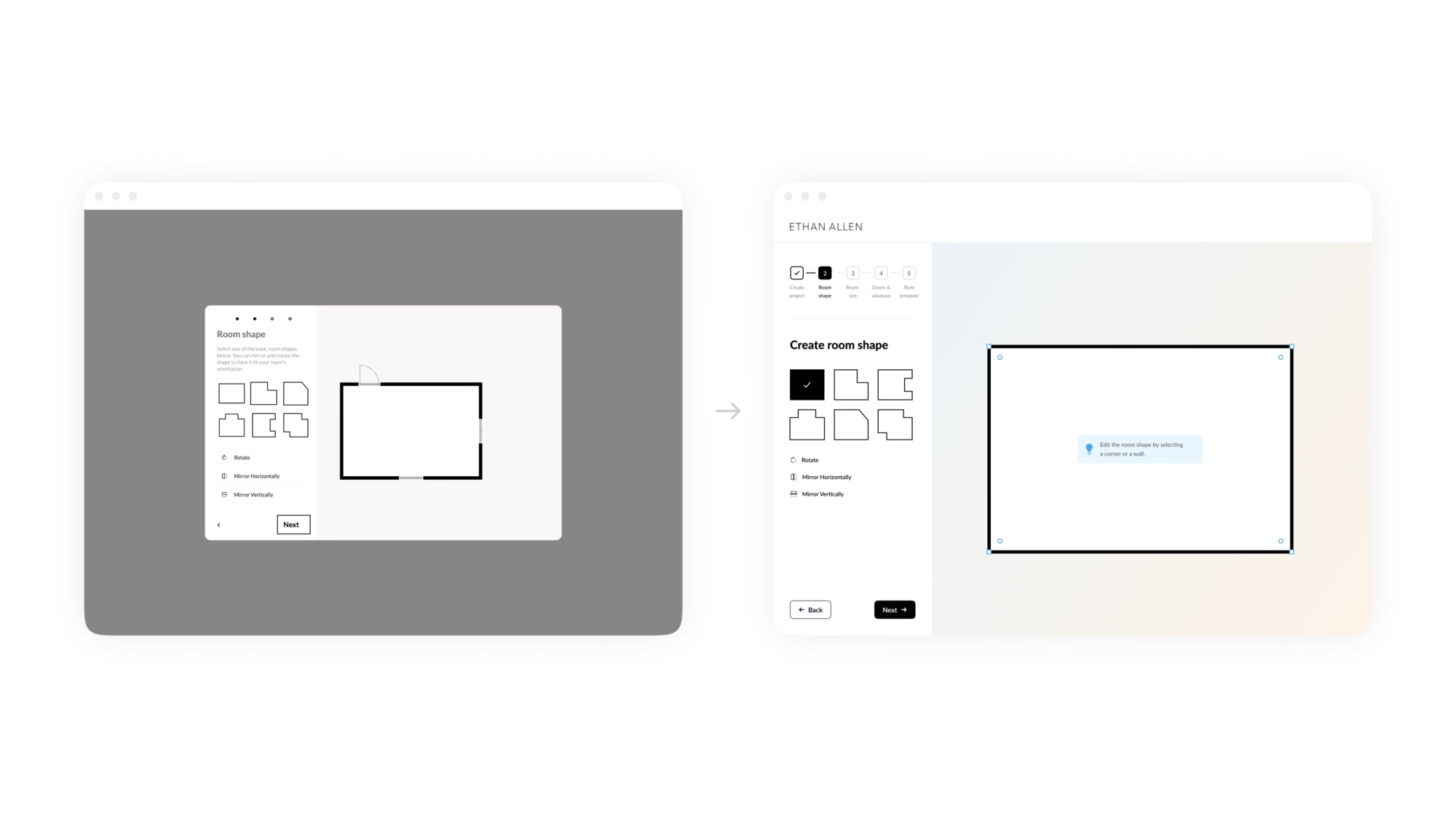
In the new design, we’ve opted for a single workflow in which all the steps are immediately clear. Once you’ve created a project, you choose the shape of your space, then the size, then you position windows and doors, and finally you can select a template. From there, you can get started.
Note: the structure and layout of the onboarding process in our design are the same as those of the tool itself. This allows users to get used to the interface right away.
Example #2 – Easily choose colours and materials for each surface
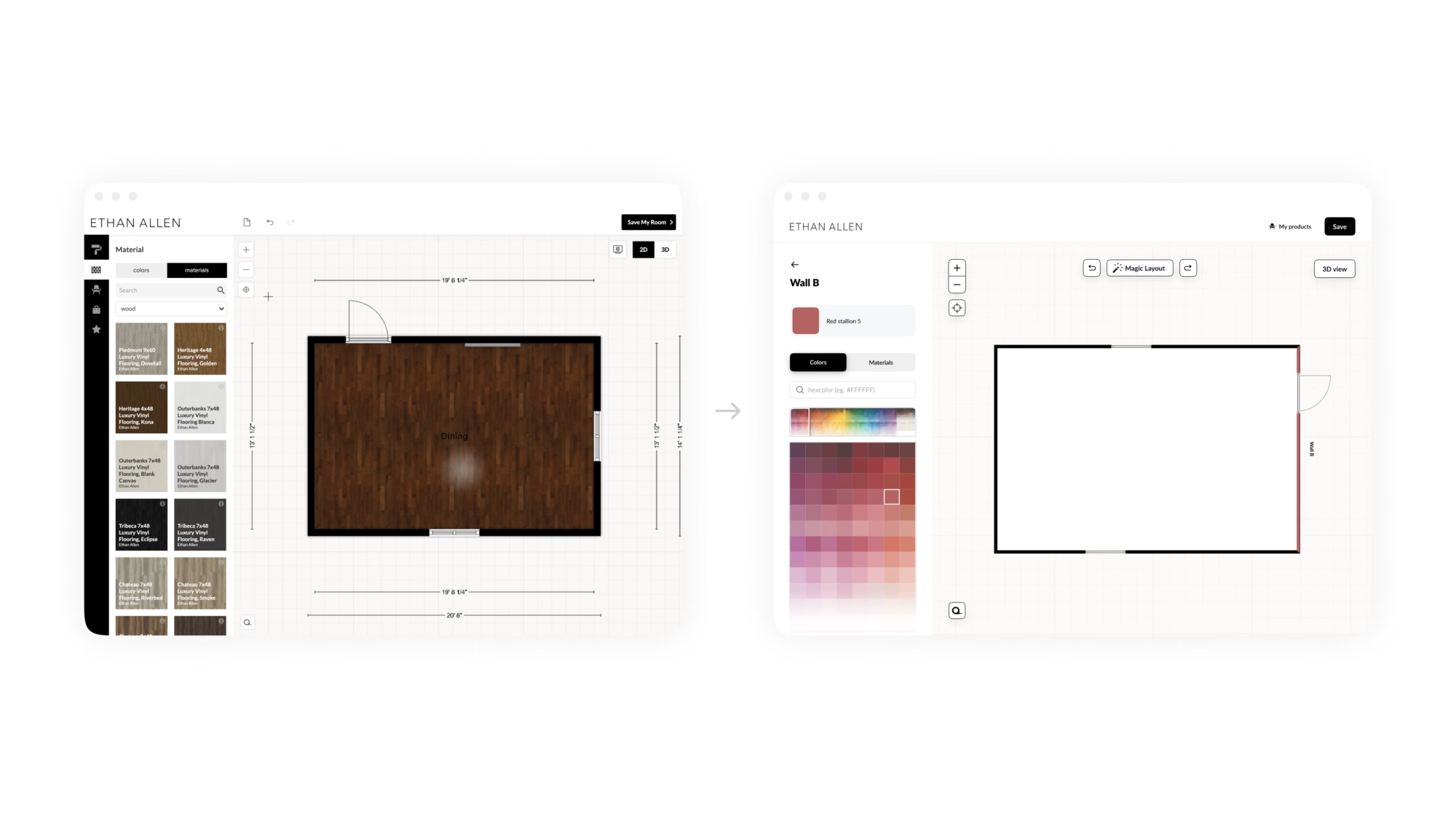
In Roomplanner, you can give all walls and floors a unique colour. You can also customise the material. During our interviews, we noticed that people found this difficult. They could choose colours and materials, but applying them to the right place was a faff: you had to drag them from the menu into your design. That was frustrating.
That’s why we’ve chosen to give each surface a clear name (floor, ceiling, wall A, wall B, etc.). Users can now easily choose a colour and material for each surface. In short: no more confusion or frustration.
Example #3 – A clear call to action
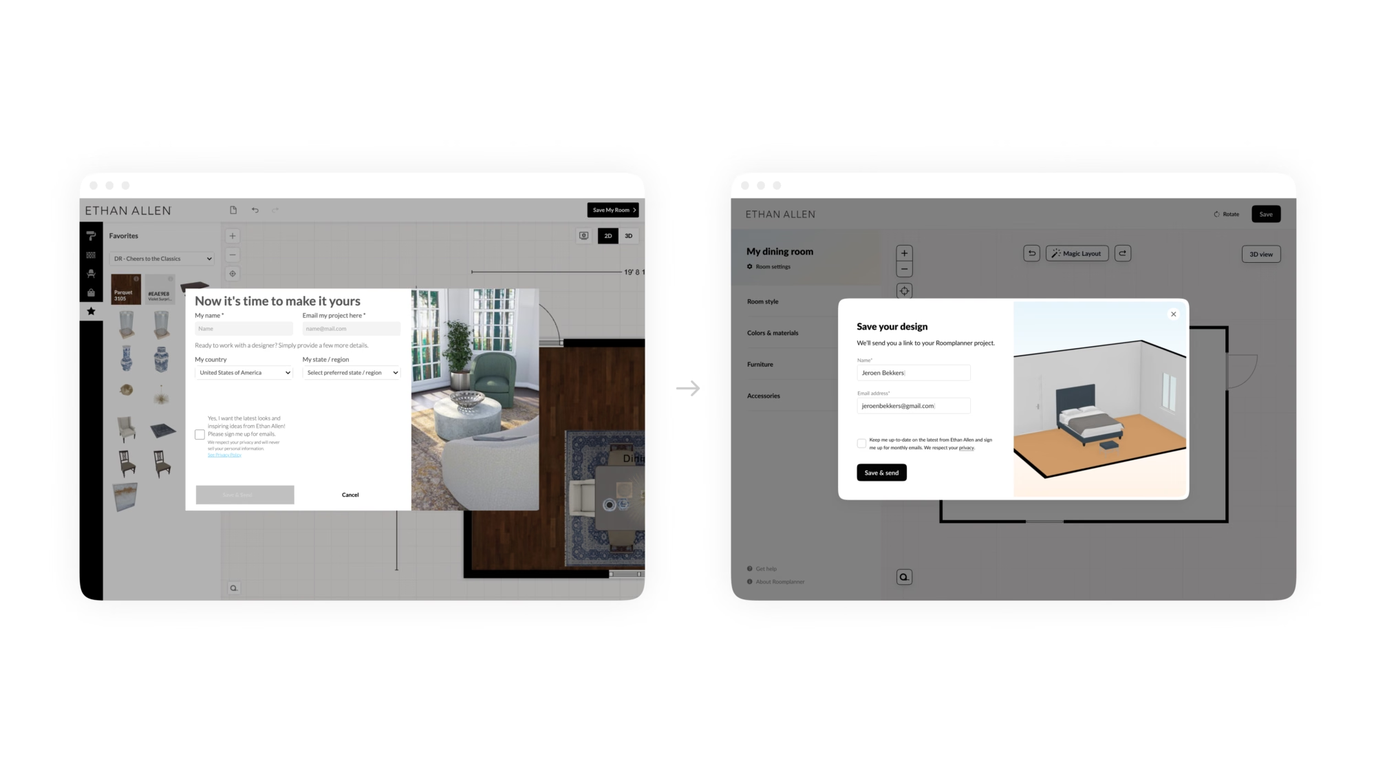
Once users have finished their design in Roomplanner, they can save it (in exchange for their email address). They can also indicate whether they’d like help from a designer to finalise their creation. In the old design, all of this was on a single screen. This didn’t work: users didn’t realise they could choose between simply saving their design, or saving it and getting help from a designer.
It was too much information on a single screen, so we split the flow into two steps: first you save your design, and only then are you asked if you need any help.
Floorplanner can carry on, armed with plenty of inspiration
The insights gained from the test and the redesign are currently fuel for the Floorplanner team: they are improving the tool step by step.
“We should do a sprint like this once a quarter to pick up the pace. It works perfectly.”
The key takeaway from this project? Carry out a single, straightforward round of research with a few participants and redesign your product based on the insights – you’ll then gain a much clearer understanding of your customers and your product.
Authors
-
