
Design faster and better than you do now
You can do this with a design system.
No two design systems are the same. But essentially, it boils down to the following: it is an organised library of reusable components (in design and code), supported by good documentation and clear processes.
A good design system delivers a great deal:
- Consistent brand experience:
Because digital products are built using the same components, your customers enjoy a consistent brand and user experience across different products. - Shorter time to market:
As the components are ready-made, designers and developers can build and launch products more quickly. We’ve found that teams working with a design system are 10 to 40% more efficient. - More time to understand your customers:
As designers and developers no longer need to debate pixels and border radii, there is more time to listen to your customers and develop solutions to their problems. - The perfect way to ensure digital accessibility:
Over 3 million people in the Netherlands live with a temporary or permanent disability. When your components comply with the WCAG guidelines (mandatory for many organisations from June 2025), all teams using the design system can develop accessible products. This cuts both ways: an accessible product offers a good user experience to a wider target audience, thereby also improving the discoverability and conversion rates of your products.
NS has also experienced this first-hand. Below, you can read all about Nessie, the design system we built together.

Would you like to find out more about a design system for your organisation?
Bjorn Post — Lead UX Research & Product Design
Send message via LinkedIn Schedule a meeting bjorn@valsplat.nl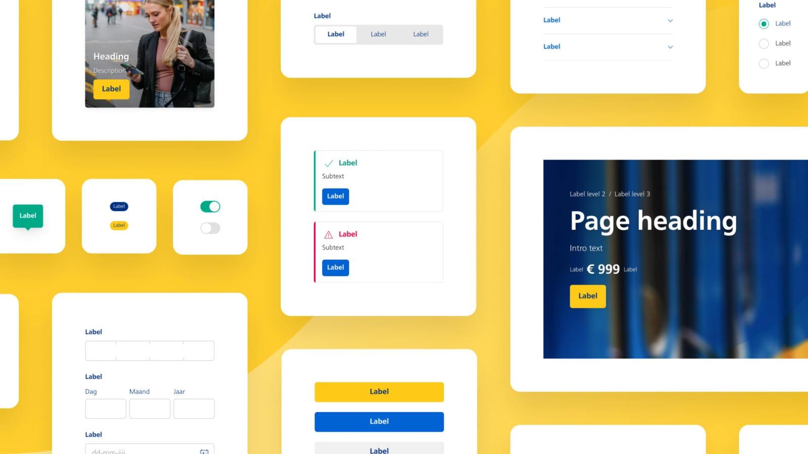
‘Nessie enables our teams to design and develop more efficiently. But above all, it ensures a consistent and accessible user experience.’

Bas Zweeris
Product Owner Nessie at NS
Services
Design System
UX/UI Design
Development with De Voorhoede and Egeniq
The challenge
NS’s digital offering has grown rapidly in recent years.
However, the way in which this has happened has presented a number of challenges. The web, iOS and Android platforms were designed and built separately from one another. Each team worked in its own way. On the one hand, this separation led to an inefficient development process. On the other hand, it resulted in inconsistencies in the design (different journey planners, duplicate sales funnels).
There was every reason for NS to do things differently. And they’ve set the bar high right from the start: a world-class online experience. They won’t settle for anything less.
The solution
To be world-class online, you need a world-class design system. A design system ensures that you can design and develop new solutions in no time at all. And that designs are consistent across all platforms. These were precisely the problems NS wanted to solve. So we immersed ourselves in their world and set to work on the ‘Nessie’ design system.
A design system enables designers and developers to build more quickly. And not just more quickly: they can also create better interfaces. Because all the building blocks are already defined within the design system, they can devote all their time and energy to devising the best solutions. This, in turn, benefits customers. As well as better solutions, customers are presented with screens designed from a single source. This helps them recognise elements and improves ease of use.
So it’s a win-win-win situation:
- Designers can design faster and better.
- Developers can build faster and better.
- Customers experience a better product.
But what does a design system like this actually look like? And how do you build one?
Let’s take a look at Nessie.
The 4 things we love most about Nessie
A design system is incredibly detailed. It consists of design principles, fonts, visual styles, components, patterns, content and much more. To give you an idea of the whole picture, we’re highlighting our four favourite parts of Nessie.
#1 Nessie is for the Web, iOS and Android
Nessie is designed to work on the Web, iOS and Android. We call this ‘multi-platform’. This raised an important question: to what extent do we want to standardise the design across the different platforms? For designers and developers, it’s nice to make everything consistent – that saves a lot of work. But for the user experience, that might not be the best approach. After all, each platform has its own design conventions that people are familiar with; take the ‘date picker’, for example:
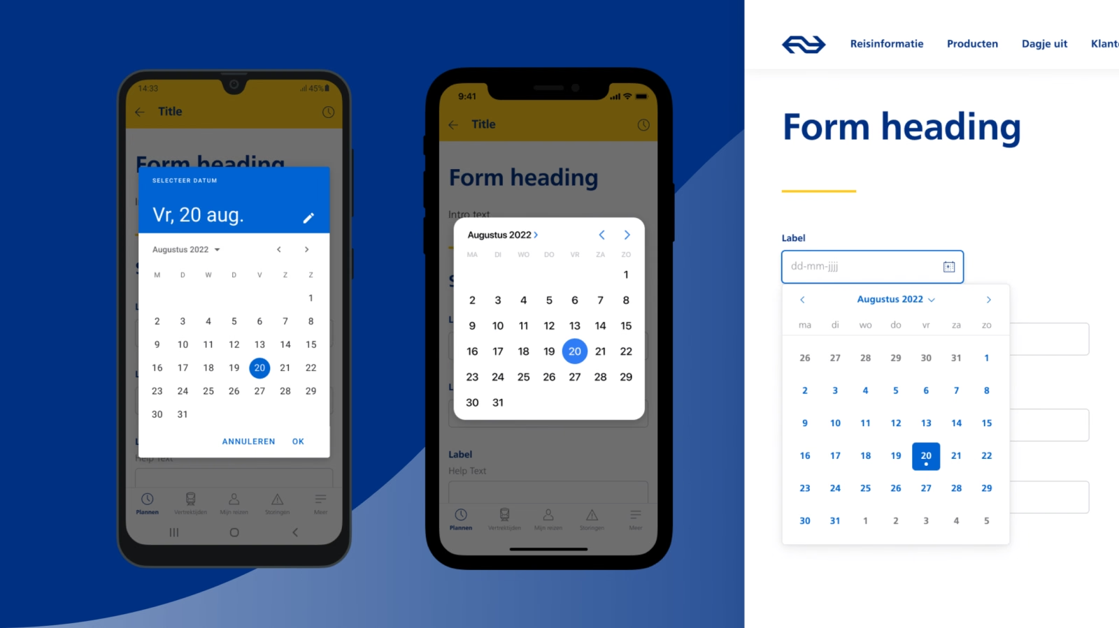
With Nessie, we stick to the standard approach as much as possible, unless it gets in the way of the customer experience. So if there are best practices for certain platforms, such as the date picker above, we follow them.
Design tokens
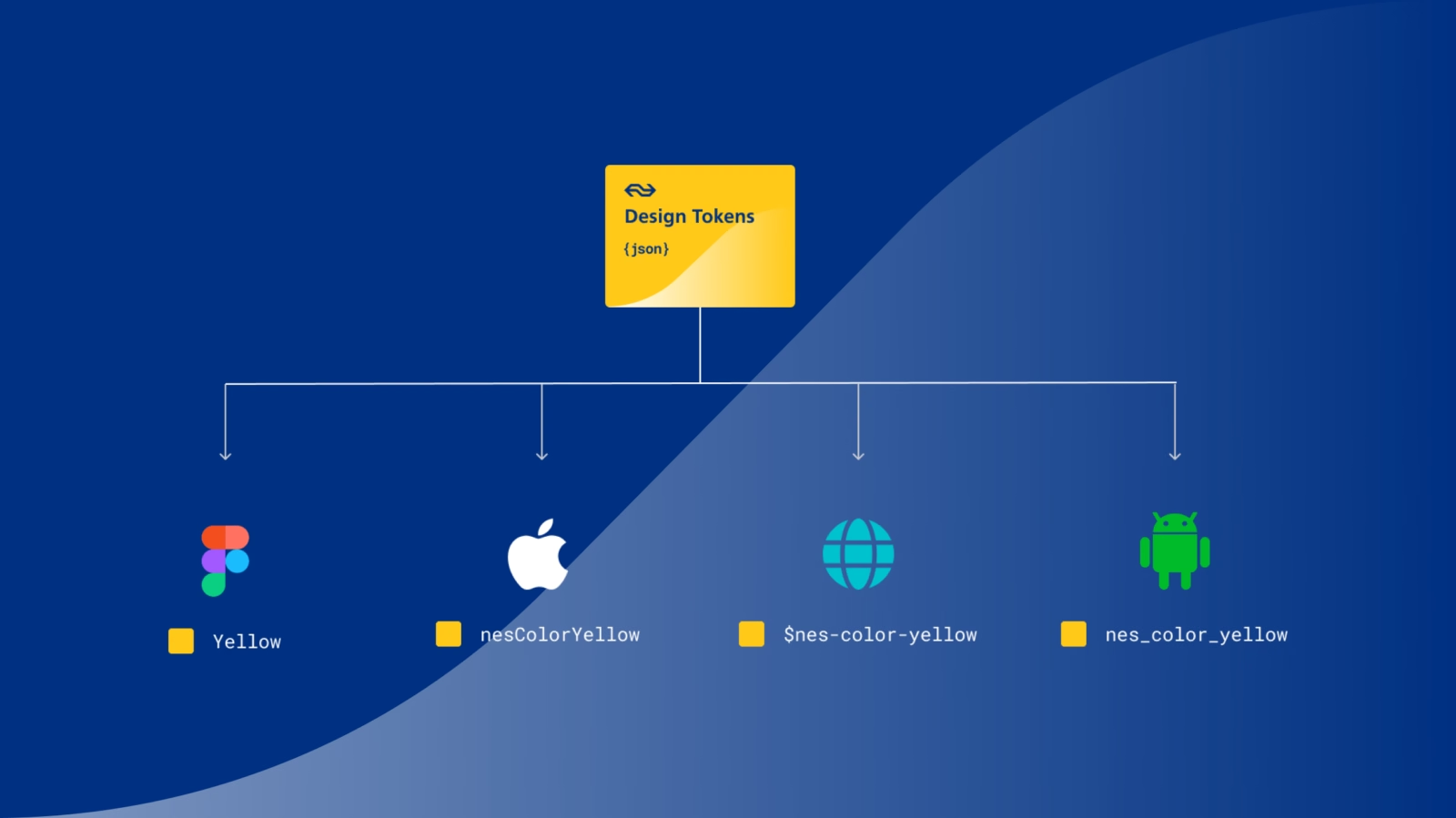
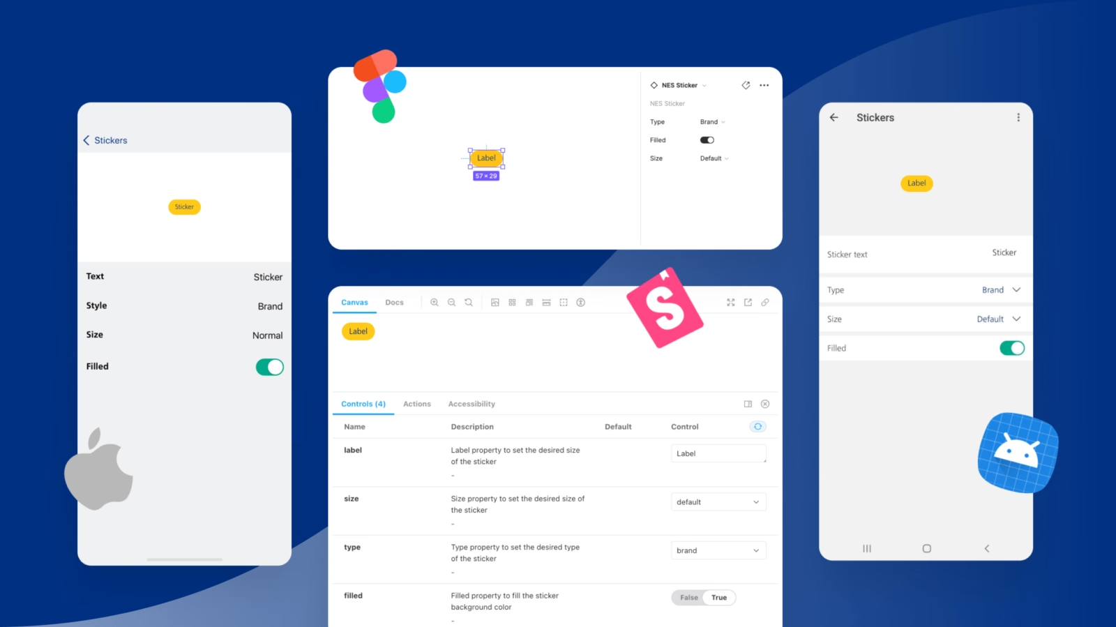
To enable us to build and design even more quickly and consistently, we use design tokens for Nessie. Design tokens are design choices that you define in one place (in a platform-independent document, such as a JSON file) and which are then applied across the various platforms.
Think, for example, of the background colour, font size or border radius. By defining it in a token, it’s automatically pushed to Web, iOS, Android and even Figma. So, if you’re rebranding and want to change the primary colour, all you need to do is update the token and everything will change across every platform.
#2 Components that are truly NS
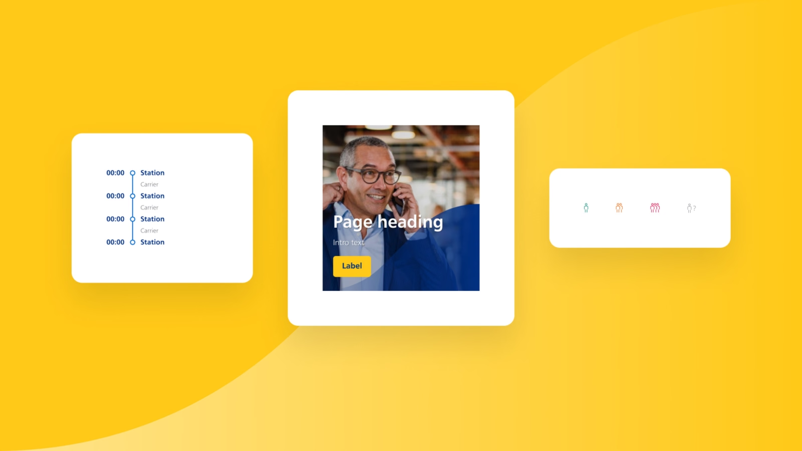
Some components feature in every design system. A ‘Button’ or a ‘Checkbox’, for example. They’re not particularly exciting. But there are also NS-specific components. Take ‘Route’: it shows which stations a train stops at. Or ‘Rush’: a component that quickly shows how busy the train is. Or the ‘Hero’: we’ve really made that one NS-specific with the visual wave effect.
By creating bespoke components, Nessie addresses NS’s design challenges as precisely as possible. What’s more, the components give you that authentic NS feel – which in turn enhances the brand experience.
#3 NS must be easy to use for everyone
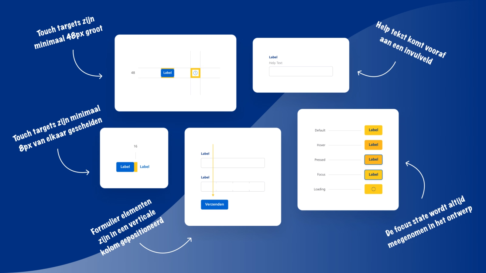
Good accessibility was a top priority for Nessie. Whether you have a visual or hearing impairment, or a motor or cognitive disability: NS must work well for you. That’s why we’ve tested every fundamental element and every component against the highest accessibility standards. Is there sufficient colour contrast? How is the content read aloud by a screen reader? To ensure everything was in order, we asked Stichting Accessibility to take another critical look at all the components.
But… having accessible components alone isn’t enough. Accessible components can still be implemented in a way that makes them inaccessible. That’s why we emphasise the importance of accessibility within the design system’s documentation environment. We’ve drawn up specific guidelines and tips for each component. This way, we can be sure that NS will be accessible in the future.
‘I want everyone to be able to use my designs. That’s why, during the design process, I take into account people living with a disability – there are millions of them.’
#4 Documentation – not necessarily exciting, but crucial
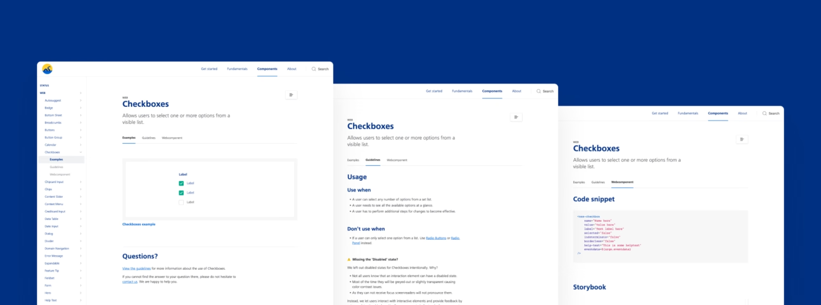
We don’t just create beautiful visuals and building blocks. Nessie’s documentation is also well put together. Good documentation is essential for a design system. After all, designers and developers work in their own environments. If you don’t align these, things will go awry.
By documenting thoroughly in Zeroheight (Nessie’s documentation environment), we ensure that components are used exactly as intended. Everything comes together in the documentation: best practices, assessment criteria for new components, UX dos and don’ts, copywriting guidelines and, not least, code. It is the single source of truth and ensures that the design system actually works.
‘The documentation is structured in such a way that anyone can build an NS design – exactly as intended.’
How Nessie came about
Now that you know a bit more about Nessie, we’d like to take you through the process. How exactly did the design system come about? What steps did we go through, and what was involved?
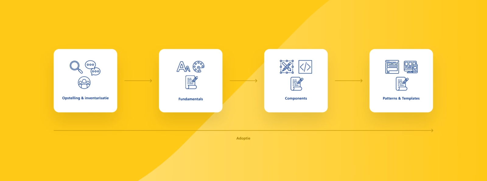
Set-up and assessment
Before you start work on your design system, you’ll need a team comprising various experts. The term ‘design system’ can sometimes mislead people: it’s not just a design-focused project – development plays just as big a role. That’s why we teamed up with De Voorhoede (for web development) and Egeniq (for app development).
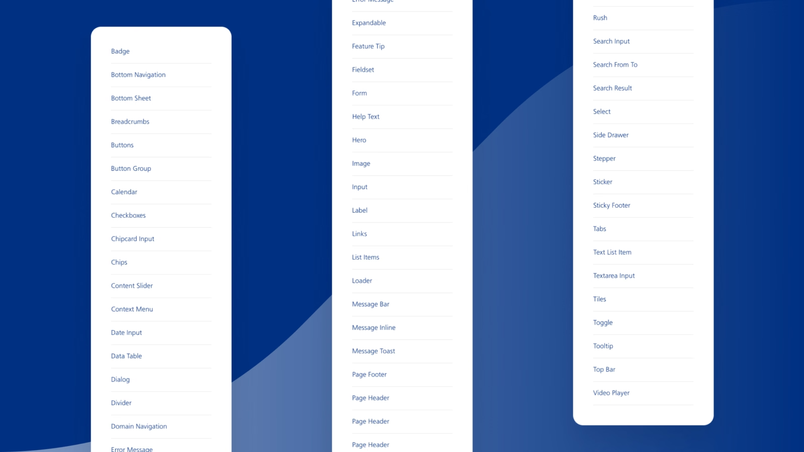
Once the team was in place, it was time to take stock. What was already in place? Was there a style guide? Which components are currently in use? And where were the inconsistencies? We all went through the available material together. We held discussions. We made some minor adjustments. We added to the list of components to be designed and built. We discussed what components should and shouldn’t be capable of. And, not least: we set up the working environment and workflows for design and development. In short: taking stock helps you create an overview.
Are the fundamentals in place?
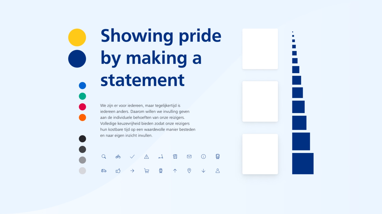
Before moving on from the analysis to designing components, it is important to consider the fundamentals. Fundamentals form the basis of your design: colours, typography, icons, but also the use of white space and shadow. NS already had a clear idea of their fundamentals. We reviewed them, refined them and further updated them during the project.
Developing components
Based on the assessment, we drew up a component list. This is an overview of all the components that need to be designed. These components will eventually enable virtually all of NS’s digital products and services to be put together with ease.
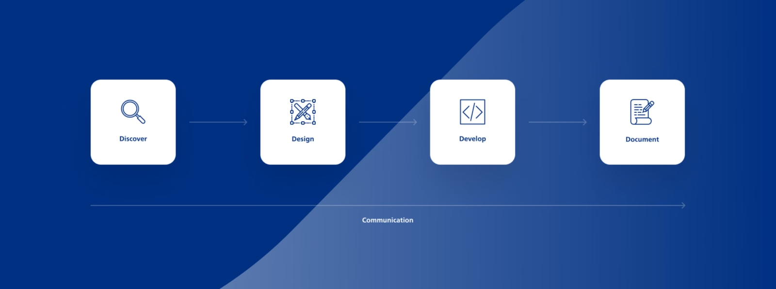
For Nessie, building a component goes something like this:
- Mapping out the context. Components are used in all sorts of ways. To understand how, we delve into NS’s Figma files and digital products. We also talk to NS designers to find out what their ideas are.
- An initial sketch. Once the context is clear, we sketch out the component. We always do this based on the fundamentals mentioned earlier. We work out different states (hover, focus, etc.) and sketch out the component’s behaviour: what happens if it contains a lot of text? And what if it’s empty? A component isn’t static.
- What does the development team say? In consultation with the development team, we refine the component. By working on components together, we start speaking the same language across disciplines. If we talk about ‘Button Secondary’ in Figma (the design tool), we also use that term in Storybook (the development tool) and Zeroheight (the documentation environment). This ensures clearer communication, better collaboration between different disciplines and, as a result, a stronger Nessie.
- Final check and documentation. Once the component has been designed and built, we go through the design and development checklists one last time. Does the component meet the requirements? Or have we missed anything? If the component passes the checklist, we document all the rules regarding its use, so that product teams know exactly how to apply it.
Patterns and templates
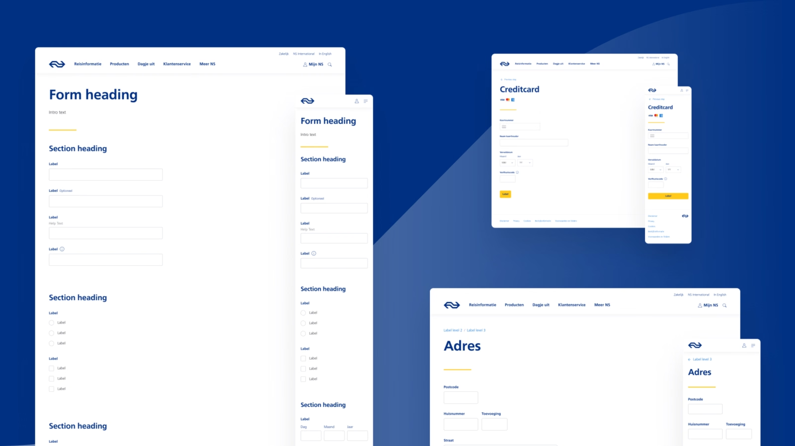
The various product teams at NS use the components from the design system to build all their platforms. It would be a shame if duplicate work were carried out within those product teams. That is why we have also included common patterns and pages in the design system.
Adoption and implementation
You can design the very best design system, but if teams don’t use it, it’s of little value. That’s why it’s important to involve users right from the start. Ask for feedback. Explain what you’re working on. Provide updates. For NS, this looked like this:
- We conducted surveys with designers and developers about their needs and expectations.
- We gave presentations on the design system in ‘UX & Angular guilds’.
- We sent out a newsletter to share what was new with every release. This way, we kept people informed and involved them in the development process.
- We set up a Slack channel to systematically collect questions and feedback.
- We let designers and developers start using the design system right from an early release. This allowed them to quickly find out how everything works and provide feedback. That helped us to improve things step by step.
- We held one-to-one meetings with the people who would be using the design system. This gave them the opportunity to ask us questions at their leisure.
‘There’s nothing more frustrating than a really cool toolbox that nobody uses. That’s why it’s so important to focus on adoption and implementation.’
Nessie is going from strength to strength
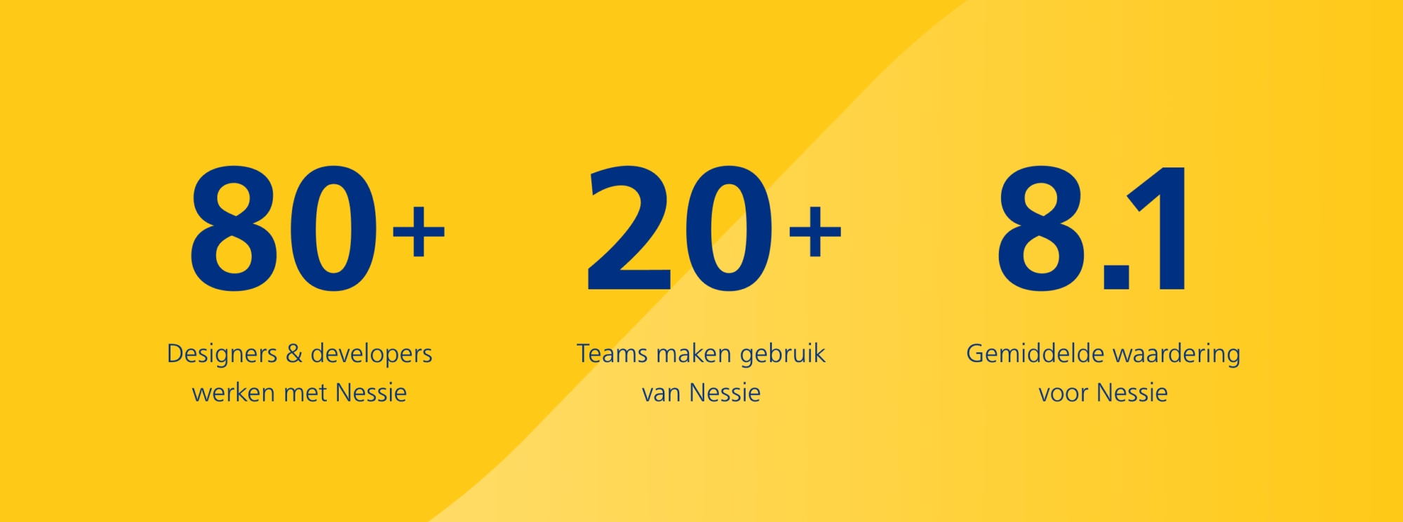
Nessie is now live and available for use by all teams within NS. We’re incredibly proud of the positive feedback Nessie has received and the speed at which all teams are making the switch:
‘Thanks to Nessie, I don’t have to reinvent the wheel; instead, I can focus on the conceptual developments that will shape the future of NS.nl.’

Maarten Lodewijk
UX Designer at NS
‘It’s impressive just how straightforward and easy it is to work with Nessie components. The guidelines are also excellent for developers.’

Isamu Ip
Front-end developer at NS
How is your design system coming along?
We’re seeing more and more organisations developing digital products at a higher level. A design system is an essential part of that. Because, as we’ve already said, it ensures that designers and developers can design faster and better. It allows them to channel all their creativity and talent into devising and developing the best solutions, rather than fiddling about with pixels and buttons.
But of course, what really matters is that a design system ensures your customers experience a more enjoyable and consistent product. A more valuable product. A more valuable digital experience.
Do you want to create a successful Design System for your organisation?
Bjorn Post — Lead UX Research & Product Design

Authors
-

-

-
