
During website development some teams focus entirely on the smallest screen, while others first consider when users need which content. Both approaches have advantages and disadvantages. Let us zoom in for you and give you our verdict.
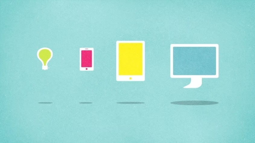
The word says it all: mobile first. You focus on the smaller screen and the limited number of pixels available. A blessing! A blessing, because you are forced to make choices. You are forced to go back to the essence — to what users really need — and you can skip all the frills. Mobile first gives you a stick to beat clients with, because “otherwise it won’t fit on the screen”. Also, scaling up the design to desktop size is supposed to be easier. After all, all the hard choices have been made.
Unfortunately, we frequently run into misconceptions. Sometimes the question “What would our users like to know when they’re on the train?” is used as a starting point. Presuming mobile phones (websites) will only be accessed when the user is on the move. Sadly, the term ‘mobile first’ appears to imply this. But this is not the case (any more). Mobile devices are used everywhere. On trains, in bathrooms or whilst slumped on the couch. The context is broader and so are users’ needs. In our view it should be ‘small screen first’, which involves the audacity to make choices. That is the essence of good design.
Content first, conducting a dialogue
Ultimately, users care about the content. The principle ‘content first’ revolves around that notion and sets individual devices aside. Instead, it tries to find out when users need what content.
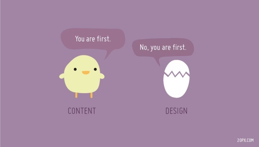
It follows that you do not start with a template design only to look at the available content afterwards. Attitudes like “usually there is a bit of copy here, so I added a this block” or “we do not have any content right now, but we’ll get to that later” are off limits. Madness. That’s not how it works in television, either. There, they’ll start with the content, then furnish the studio, build the décor and then determine camera angles. Not the other way around. The same goes for a website: the template should support the content. Because if there is no content, things will come to an end before you know it.
By the way, when putting ‘content first’ you should look beyond words and images. Content first implies so much more. We define ‘content first’ to include buttons, labels, calculation modules, forms, etc. All the elements necessary to conduct a dialogue with your user.
Mobile and content first
Combine both principles. Mobile first — small screen first, really — hands you a persuasive point to make choices and to identify which elements deserve priority. Subsequently, ‘content first’ helps you to tell your story the right way and at the right time.
In conclusion, you should have all expertise involved from the outset: from designers to copywriters and everyone in between. Making the right decisions and creating a compelling story can only be done when you team up.
Auteurs
-

-
