In the Netherlands alone, a few million people live with some sort of disability. Worldwide the estimation is about 650 million people. That’s close to 10% of the world population. Why are we throwing all these numbers at you? Because disabled people very often use your site or app a little differently than you think. And if you don’t take that into account, you might exclude lots of people from using your product or service.
Good accessibility is a moral obligation
The large number of people it concerns makes good accessibility – the responsibility to make websites and apps accessible for everyone – a moral obligation. It’s important to understand the diversity of people with disabilities: from blindness and deafness to people with a motor impairment or dyslexia. They all experience and go through the digital world in their own way. Some people use a screen reader for instance. And some people do everything with their keyboard. Keeping this in mind while building your site or app helps avoid exclusion.
Helping people is good for business
Good accessibility is not just a moral obligation, it’s also a commercial opportunity. An accessible website:
- reaches a larger audience, so more potential customers
- makes your site more navigable for search engines, so it’s good for SEO
- is good for your brand image
- is more compatible with new technologies, like voice assistants.

8 basics tips to boost accessibility
Before we get to the tips, we want to point out that the best way to improve the accessibility of your site is to sit down with disabled people. Have them go through your site and listen to their stories.
But that’s not what you’re here for right now. You’re probably looking for some concrete tips – we’ve worked out 8 of them. Partly based on some interviews we did with visually impaired people. And partly based on best practices.
If you’re familiar with the principles of accessibility, it’s probably nothing new under the sun. If you’re new to the topic, these 8 tips will help you get some basics right.
“I was told that websites are made with a keyboard. Then why can’t websites be used with a keyboard?”
#1 Make sure your site is also accessible with a keyboard only
People with a visual impairment mainly use their keyboards to navigate through websites. So make sure all elements of your site are accessible with a keyboard. Prevent people from getting stuck. The sequence of navigating is also important – it has to be logical.
Rob, one of our participants, said the following: “If I visit a website for the first time I always have my screen reader read it first. It helps me understand where I can find what. Once I understand the website, I use the arrows on my keyboard to get my job done.”
#2 Use clear ‘focus states’
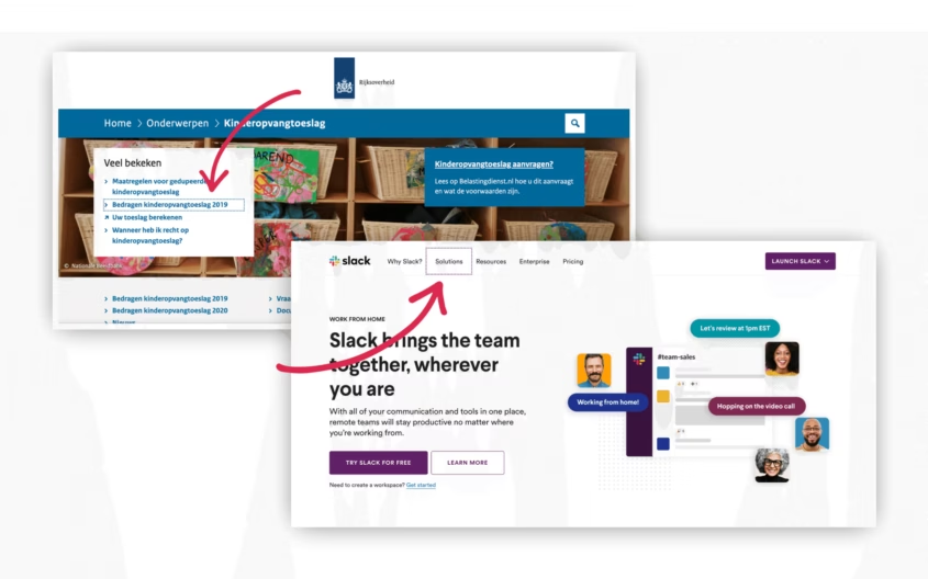
When people navigate with their keyboard, they often use the tab key. By pushing the tab key the ‘focus’ shifts from one interactive element – hyperlinks, input fields, or buttons – to the other. The element that gets focus is read out loud by accessibility software. Don’t forget to make the focus state visually clear for people who aren’t entirely blind.
#3 Offer a ‘skip link’
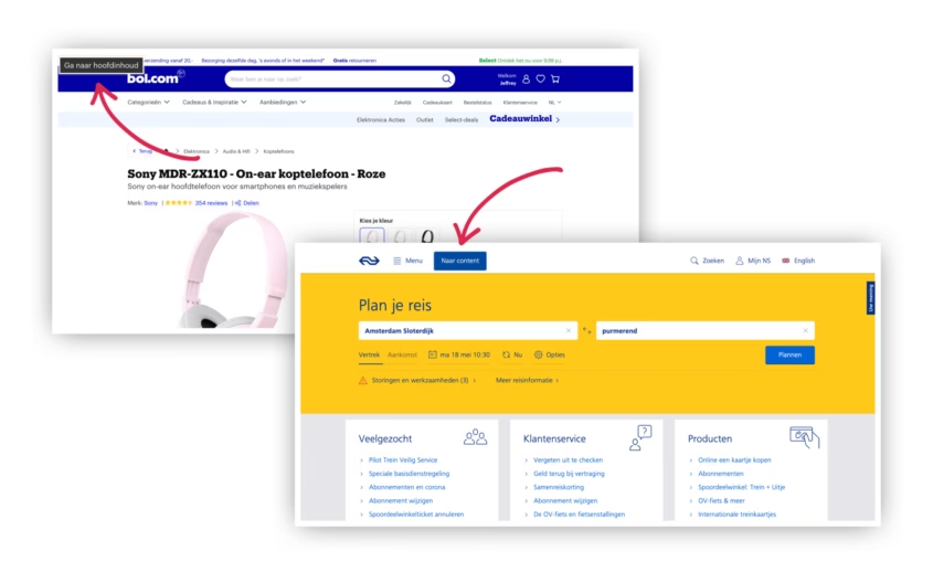
Imagine: everytime you visit a website you’re obliged to go through the entire menu – step by step – before you can move on to the content. And that doesn’t happen just once, but on every new page you visit. We bet you’d smash your keyboard after visiting three webpages.
Visually impaired people have to go through this hassle more often than not. On many sites they have to tab through the entire menu before they land on the content. And keep in mind that every menu item gets read out loud. So it’s a very tedious and time consuming process. Especially because they have to go through this on every single page.
This problem is super easy to fix by adding a ‘skip link’. The skip link isn’t visible at first, but once you push the tab button for the first time, it appears. By activating the link you can skip to the content right away.
#4 Use sufficient contrast
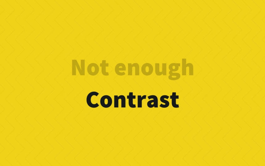
Everybody benefits from sufficient contrast between text and background – visually impaired people in particular.
Make sure you use the right contrast by using a ‘color palette generator’ that takes accessibility into account, like accessiblepalette.com or colorsafe.co. Or determine the contrast of text and background colors by yourself with tools like color.review or contrast-ratio.com.
#5 Always combine colors with text
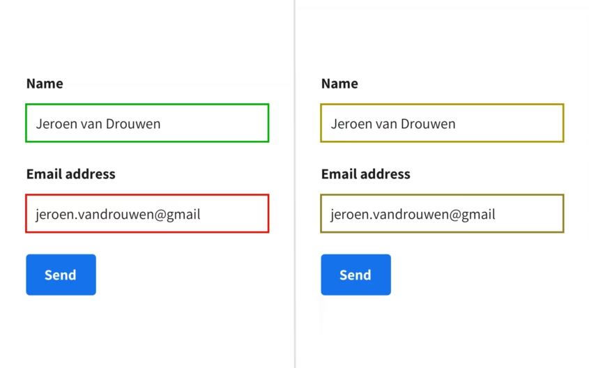
For people suffering from color blindness, it’s hard to interpret information that’s solely communicated by colors. So always ask yourself: is the information still easy to understand without depending on colors?
Don’t just work with colors to get your message across. Use text, icons and /or other visual elements to clarify your message.
You can test how someone with color blindness sees your design by using a ‘color blindness simulator’ like the Stark or the Google Chrome plugin Colorblindly.
#6 Typography matters
People with visual impairments have a hard time reading small text. So make sure the font size is big enough for everybody to read comfortably.
A safe rule of thumb is a minimum size of 16px. Even better than using ‘fixed-size-units’ like pixels, are relative values like ‘em’ or ‘rem’. Why? Browsers allow you to change standard text sizes. Visually impaired people use this functionality a lot. When you work with relative values everything scales nicely. A pixel, on the contrary, stays a pixel and doesn’t scale.
#7 Text over images

For blind or visually impaired people it is, obviously, hard to interpret images or icons. So make sure you always combine them with text. Help people understand the message even if they can’t see the images or icons.
Don’t use images when text can communicate the same thing. If you want some visual support, go for icons that people are used to associating with certain actions. Think of a trash can to say something can be deleted. Or a magnifying glass for search.
#8 Keep forms short and simple
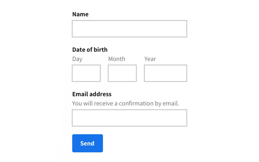
For people with a motor impairment, it’s often harder to fill out a form. So check your forms: are they simple and do they only ask what’s absolutely needed? Keep it short, sweet, and simple.
Present your input field in a vertical column. This way people (who use a screen magnifier for instance) don’t have to reorientate after every input field. Exceptions to this rule are short and logical input fields, like a start and end date. You can put those in the same row.
This was just the tip of the iceberg
The 8 tips above are a super easy and quick way to boost the accessibility of your site or app. But bear in mind: it’s just the tip of the iceberg. Do you want to go deeper? Go out and talk with a diverse group of disabled people. Or check the ‘Web Content Accessibility Guidelines (WCAG)’ of the ‘Web Accessibility Initiative’ – they go into detail, but it’s pretty dense.
Want to share your thoughts on accessibility or ask some questions? Contact us.

