
Making an impact – that’s what matters most to us. We work hard every day to make the digital world a more human place. And when we get to do that work for impactful organisations like War Child, it makes us even happier.
The challenge
War Child has offices in various countries. Each of these countries has its own website, featuring its own initiatives. In addition, there is a global website. This site is not aimed at small donors, but at strategic partners and academics worldwide.
The global website is in need of an update. Before War Child sets about this, they first wanted to find out how the target audience experiences the current site. How exactly do they navigate it? What do they think of the features? Is the language clear? And what information do they need?
The solution
Questions such as those raised by War Child are answered through a UX test. We held online discussions with academics and strategic partners. We spoke to people in the Netherlands, Brazil, Canada, Switzerland and the UK. Through six interviews, we learnt all about how the target audience experiences the site and what could be improved. That is the power of a UX test: it is relatively small-scale and simple, yet it sheds a great deal of light on the situation.
Services
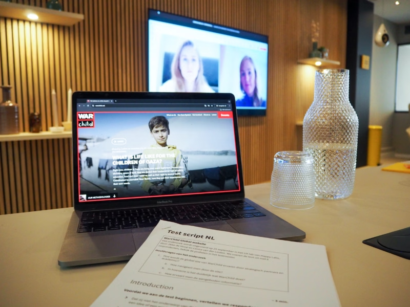


Three things you can learn from the UX test we carried out for War Child
When you carry out a UX test, you learn all about the experience users have with your specific website or app. But there are always some general insights that emerge as well. Insights that you can apply to any digital product. We’ve listed three of those general insights that emerged from the research for War Child – so that you can put them into practice too.
#1 Ensure a good narrative flow
During the interviews, we observed how War Child’s target audience navigated the website. We learnt what information they were able to find easily, and we saw what was still missing. And it’s not just about the presence of information; it’s also about the structure. The order in which you present information must align with the questions users are asking themselves.
In a UX test, you learn exactly what information your target audience is looking for and in what order they take it in. What we see time and time again during research is that if you base your narrative and structure on assumptions, you’ll almost always get it wrong.
The order in which you present information should reflect the questions users are asking themselves.
#2 Design should never get in the way of your story
Even if you provide the right information in the right order, users can still get stuck. This has to do with the way you present information, with your interactions. Sometimes so many design elements come together that users no longer know where to click.
Academics and strategic partners visit the War Child website to read more about specific topics, to dig deeper. For a long time, this wasn’t always possible due to visual clutter. The layout was too busy. There were many different reading paths. As a user, you could go in too many directions. There were all sorts of buttons, arrows and small interactions you had to use to wade through the information. The information available was very valuable – but users simply couldn’t access it properly because the design got in the way.
The lesson to be learnt here? Simple design is often better, because it’s easier to use.
Simple design is often better, because it’s easier to use.
#3 Your target audience is the deciding factor
Your target audience determines everything when it comes to what you do and don’t show on your site. War Child’s global site was, in terms of design, a carbon copy of the consumer site. As a result, academics and strategic partners did not always feel it was relevant to them; they wondered whether the site was actually intended for them.
On a consumer site, you keep everything concise. Long reports aren’t particularly relevant. On a site for academics and strategic partners, however, you do make reports very prominent. Information needs vary by target audience. And that has implications for your website. You can’t simply present the same website to different target audiences. Sometimes it really does require something different – in terms of information, flow and hierarchy.
A UX test helps you discover exactly what your target groups expect and need. You’ll see where they’re similar, but above all, how they differ from one another.
You can’t simply present the same website to different target audiences.
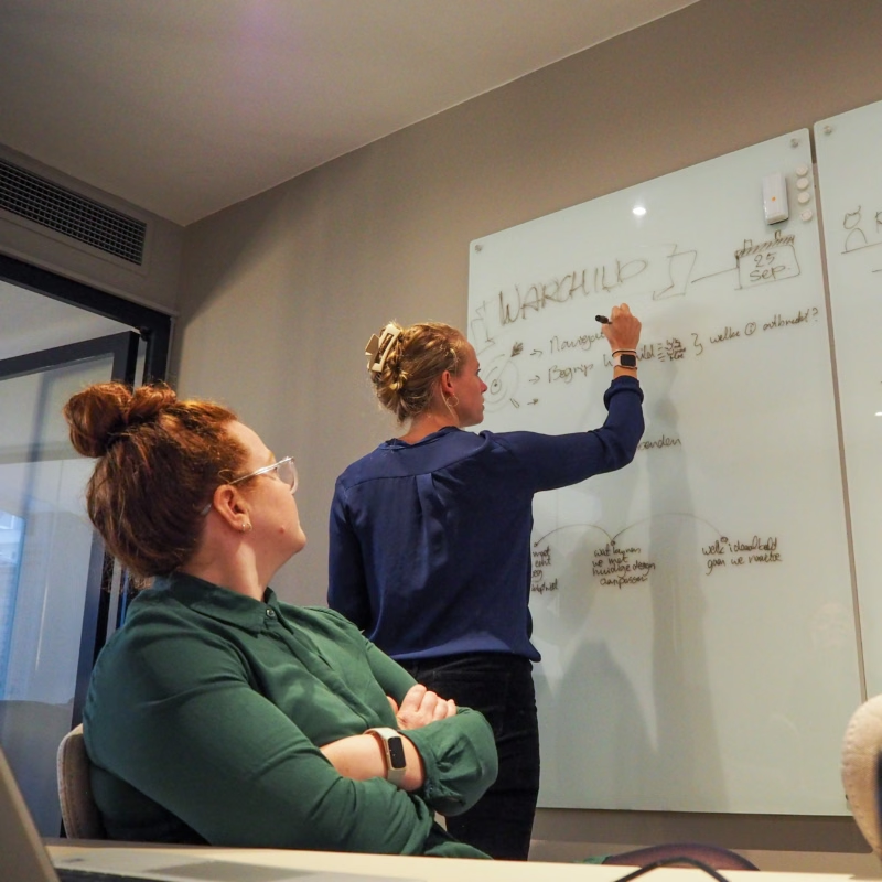

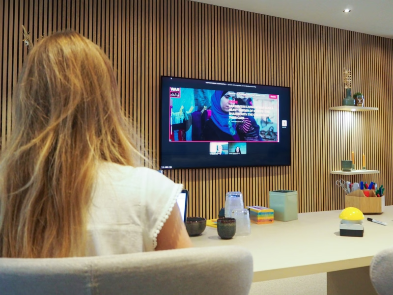

How did the UX test for War Child work?
There’s a lot we could say about the design of the UX test for War Child. We’ll highlight a few key points for you:
- Hybrid research. We conducted the test in a hybrid format: partly online, partly in person. The interviews had to be conducted online due to the international nature of the target group. We, however, were based in the lab, alongside the War Child team. We watched the interviews. We discussed what we saw. That in-person element – being together in the lab – really adds something.
- Ensuring insights really hit home. During the presentation of the insights, we showed video snippets from the interviews. This helped bring everything we’d learnt to life, allowing people who weren’t present on the research day to still feel and experience who their target audience is.
- Concrete solutions. We didn’t just deliver a pile of insights. We also visualised them. We showed where the issues lay and how War Child could resolve them. This ensures that the designers who will ultimately be working on the project can easily take over from us. We also provided next steps and tips for any follow-up research. That’s the advantage of a UX test: as well as gaining a wealth of new insights, you immediately discover what you don’t yet know – and what you need to investigate further.
Want to know more about how a UX test works?
Would you like to engage with your customers too?
Nils van den Broek — Founder

Authors
-

-
